Home / Blog / Design & Branding
Building a Dry Bag Colour Range
A dry bag colour range works best at four to six colourways built on a 70/20/10 split: two permanent neutrals that carry roughly 70% of unit volume, one or two brand accents around 20%, and a seasonal shade at 10%. Five sizes across five colours produces 25 SKUs, 25 photo sets and 25 inventory lines, which is more than most first-season ranges can support; three sizes across four colours gives 12 SKUs and keeps the 500-piece minimum per colourway realistic.
This guide walks through the decisions behind that split in the order a range actually gets built: how many shades you need, which neutrals survive in every channel, how to hold a Delta E of 1.5 across fabric, film, webbing and hardware, which fastness numbers to write into a specification, and what a fifth colourway really costs once fabric minimums, labelling and photography are counted. Every figure here comes from production ranges, not from a mood board.
- How many colourways a dry bag range actually needs
- The 70/20/10 split: core, accent and seasonal colours
- Choosing core neutrals that sell in every channel
- Accent colours: where brightness earns its keep
- Matching colour across fabric, film, webbing and hardware
- Colour fastness testing: reading the numbers
- Solution-dyed yarn, piece dye and print: three routes to colour
- Camouflage and pattern: scale, repeat and licensing
- What each extra colourway really costs
- Mapping colourways onto sizes and formats
- Retail and e-commerce presentation of a colour range
- Colour decisions that survive a product refresh
- A colour brief you can hand to a production partner
How many colourways a dry bag range actually needs
Start from SKU count, not from taste. A dry bag range multiplies: every shade you add is multiplied by every size and every format in the line. A launch with three sizes and four colours produces twelve SKUs, which one photo day and one warehouse pallet can absorb cleanly. Push the same line to five sizes and six shades and you are at thirty SKUs, and the marginal shade now costs more in working capital than it returns in sell-through.
The practical ceiling for a first season is four to six colourways, and the floor is three. Below three the range looks unfinished on a shelf and gives a retailer nothing to differentiate with; above six the slowest two shades will account for under 8% of units while consuming roughly a quarter of the inventory budget. Ranges that start narrow can always add a seasonal shade in year two once real sell-through data exists.
The 70/20/10 split: core, accent and seasonal colours
Splitting the range by expected unit share keeps the line honest. Core neutrals are the shades that reorder every season and never go on markdown: black, olive, charcoal grey. Accents are the shades that make the product recognisable in a photograph: safety orange, mint, cobalt. Seasonal shades are the experimental ones, tied to a specific trend window and dropped if they miss.
The split also dictates how you buy fabric. Core colours are bought in full rolls against an annual forecast because you know they will run again; accents are bought in half rolls; seasonal shades are bought once, at the minimum, and written off if they do not repeat. That difference alone changes the landed cost of a bag by several percentage points before any construction decision is made.
| Role | Share of units | Typical colours | Fabric buy | Reorder policy |
|---|---|---|---|---|
| Core neutral | 60-70% | Black, olive, charcoal | Full roll, annual forecast | Auto-reorder |
| Secondary neutral | 10-15% | Grey, sand, navy | Half to full roll | Reorder on 60% sell-through |
| Brand accent | 10-20% | Orange, mint, cobalt | Half roll | Reorder seasonally |
| Seasonal shade | 5-10% | Pantone of the season | Minimum buy only | No reorder |
| Pattern or camo | 5-12% | Print or licensed artwork | Print run, one-off | Reorder only if top five |
Choosing core neutrals that sell in every channel
Black is the anchor of every waterproof range for a reason that has nothing to do with fashion: it hides salt staining, scuff marks and sunscreen residue, and it photographs consistently under retail lighting. Expect 30% to 40% of unit volume in black for paddlesport and dive-adjacent channels. Olive and charcoal take most of the remainder in outdoor and hunting-adjacent channels, where a bright bag is a liability rather than an asset.
Neutrals are also where consistency matters most, because they are the shades a buyer reorders blind in year three. Lock the reference under three light sources before approval: D65 daylight, 4000 K retail LED and a warm 2700 K showroom source. A charcoal that reads neutral under D65 and violet under retail LED will generate returns even though every lab number passed, which is metamerism rather than a colour error.
Accent colours: where brightness earns its keep
Bright shades do three jobs on a waterproof product. They make a bag findable in moving water, they make a range recognisable in a feed thumbnail, and they let a buyer price a premium tier without changing the tooling. A safety orange or signal yellow dry bag is genuinely easier to spot 200 m offshore than an olive one, and that is a functional claim you can defend rather than a styling preference.
The trade-off is heat and staining. A saturated orange surface sitting in 32 °C direct sun measures roughly 12 °C to 18 °C cooler than the same bag in black, which matters if the product doubles as a cooler, but light shades show sunscreen, tanning oil and clay far more readily. Pick light accents for products with a short service window and reserve dark neutrals for rental fleets where appearance after two seasons is the buying criterion.
Matching colour across fabric, film, webbing and hardware
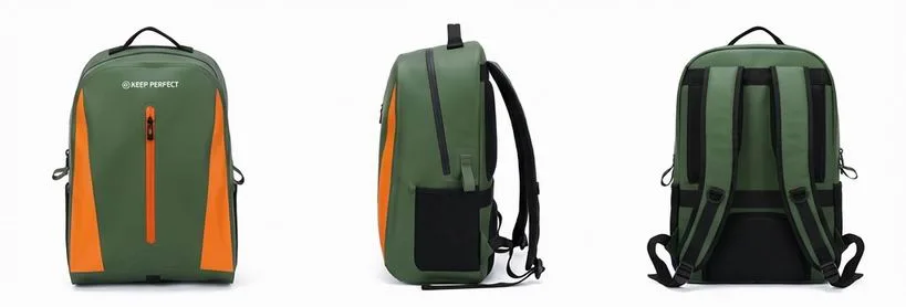
A colourway is not one colour; it is four substrates that have to agree with each other. The coated shell takes dye as a woven textile, the TPU film is translucent and shifts darker over a printed face, the webbing is usually polyester or nylon with a different dye affinity, and the hardware is moulded POM, anodised aluminium or coated steel. Match them in daylight on a real assembly, not on separate swatch cards.
Set a numerical tolerance for each pairing and write it into the specification. A Delta E of 1.0 or better under CIEDE2000 is achievable between shell and webbing when both come from the same dye house; film over print typically lands at 1.5 to 2.5 because the laminate adds optical depth; hardware will never match textile exactly and should be specified as a deliberate contrast or as a neutral black. The ISO grey scale and the ASTM colour-difference method are the two references buyers recognise.
| Component | Substrate | Delta E target (CIEDE2000) | Common failure | Fix |
|---|---|---|---|---|
| Shell fabric | 420D or 500D woven, TPU laminated | 1.0 vs master | Batch-to-batch drift | Approve lab dips, keep a signed reference |
| Webbing | Polyester or nylon tape | 1.0-1.5 vs shell | Nylon absorbs more dye | Dye webbing to a physical shell swatch |
| TPU film | 0.3-0.5 mm, clear or tinted | 1.5-2.5 vs printed face | Film darkens the print | Pre-compensate artwork by 5-8% |
| Buckles | POM, moulded | Contrast only | Metamerism under LED | Specify black or a stated contrast |
| Thread / weld line | Bonded polyester | Nearest neutral | Visible contrast at seam | Use a neutral thread across all shades |
Colour fastness testing: reading the numbers
Fastness is where a colour range either holds up on the water or generates a season of complaints. The four tests that matter for a waterproof bag are light, rubbing, seawater and chlorinated water. Light fastness is graded 1 to 8 under xenon arc exposure; rubbing is graded 1 to 5 dry and wet; seawater and chlorine are graded 1 to 5 against a grey scale. Anything below grade 4 on rubbing or grade 4-5 on light is a liability in a saltwater channel.
Write the targets into the purchase specification rather than relying on a general claim of colour fastness. A bag that grades 3 on wet rubbing will transfer dye onto a light-coloured rash vest within a single afternoon of use, and that is the kind of failure that ends a retail relationship. Ask for the test report by standard number and batch date, and re-test when the dye house changes.
| Test | Reference standard | Target grade | Typical pass | Failure symptom |
|---|---|---|---|---|
| Light, xenon arc 40 h | ISO 105-B02 | 4-5 or better | 5 on black and olive | Accent fades pink or chalky |
| Rubbing, dry and wet | ISO 105-X12 | 4 dry, 3-4 wet | 4-5 dry on coated face | Dye transfer onto clothing |
| Seawater immersion | ISO 105-E02 | 4 or better | 4-5 on solution-dyed | Bleeding at the roll line |
| Chlorinated pool water | ISO 105-E03 | 4 or better | 3-4 on bright accents | Accent dulls after a pool season |
| Perspiration | ISO 105-E04 | 4 or better | 4-5 | Collar and strap staining |
| Domestic wash, 40 °C | ISO 105-C06 | 4 or better | 4-5 on laminated face | Shade shift after first clean |
Solution-dyed yarn, piece dye and print: three routes to colour
There are three ways to put colour on a waterproof shell and they behave very differently. Solution-dyed yarn, also called dope-dyed, has pigment added to the polymer before extrusion, so the colour runs through the fibre rather than sitting on it. Piece dye colours finished greige fabric in a bath. Printing lays ink on the surface, either as a flat shade or as artwork.
Solution-dyed fabric gives the best light and seawater fastness and the lowest water use per metre, but the colour library is narrower and the minimum per shade is higher. Piece dye offers the widest library and the lowest minimum, at the cost of more batch variation. Printing is the only route for artwork and the only route with a genuinely low minimum, which is why a seasonal or test shade usually starts as a print.
| Route | Fastness, light | Minimum per shade | Batch consistency | Best use |
|---|---|---|---|---|
| Solution-dyed yarn | 6-7 | 500-1,000 m | Excellent | Core neutrals, rental fleets |
| Piece dye | 4-5 | 300-500 m | Good with lab dips | Accents and mid-volume shades |
| Digital print | 4-5 | 50-100 m | Excellent within a run | Seasonal shades, test colours |
| Screen print | 4-5 | 300-500 m | Good, screen wear over run | Flat artwork, spot logos |
| Laminated film tint | 5-6 | 500 m film | Excellent | Translucent and frosted effects |
Camouflage and pattern: scale, repeat and licensing
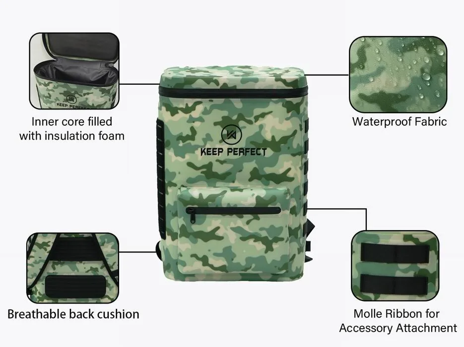
Pattern behaves like a colourway in a range plan but costs like artwork. A camouflage or graphic repeat needs a defined scale relative to the product, a repeat length that does not land an obvious motif seam across the panel, and a registration tolerance, typically plus or minus 1.5 mm, that the print method can actually hold on a coated face. On a 5L bag a large hunting-scale repeat reads as a single muddy block; the same artwork at 60% scale reads as pattern.
Licensed patterns carry a royalty per unit and a reporting obligation, so they belong in the seasonal tier rather than the core tier. If you want the look without the licence, develop an original repeat and register it, and keep the file in a vector format that scales from a 2L grab bag to a 90L expedition bag without redrawing. Pattern ranges also need their own naming convention, because 'camo' alone is not a SKU identifier once you run three variants.
What each extra colourway really costs
The fabric is the least of it. A fifth colourway adds a fabric minimum you may not consume, a label and hang-tag variant, a barcode, a photography set, a warehouse bin, and a forecasting line that will be wrong in both directions. In ranges we have costed, the marginal shade adds between 4% and 9% to the landed unit cost at low volume, most of it in fabric minimums and write-off risk rather than in material.
The cheapest way to add visual variety is to change a component rather than a shell. A second webbing colour, a contrast weld line, or a different buckle finish refreshes a product at a fraction of the cost of a new fabric buy, and it does not add a fabric minimum. That is why a well-planned range often has four shell colours and six visible variants.
Mapping colourways onto sizes and formats
Not every colour should exist in every size. Small grab bags sell on visibility, so bright accents earn their place at 2L to 10L. Large expedition bags sell on durability and price, so 60L and above should run in two neutrals only. Applying that filter typically removes a third of the SKUs from a full matrix without removing any shade from the range.
Format matters as much as size. A duffel or tote is carried in public and photographed in lifestyle settings, so it can carry an accent that a hatch bag cannot. A roll-top that lives inside a kayak hatch is never seen, and the correct decision there is one neutral that hides abrasion. Build the colourway matrix as a grid and delete the cells that have no channel behind them.
Retail and e-commerce presentation of a colour range
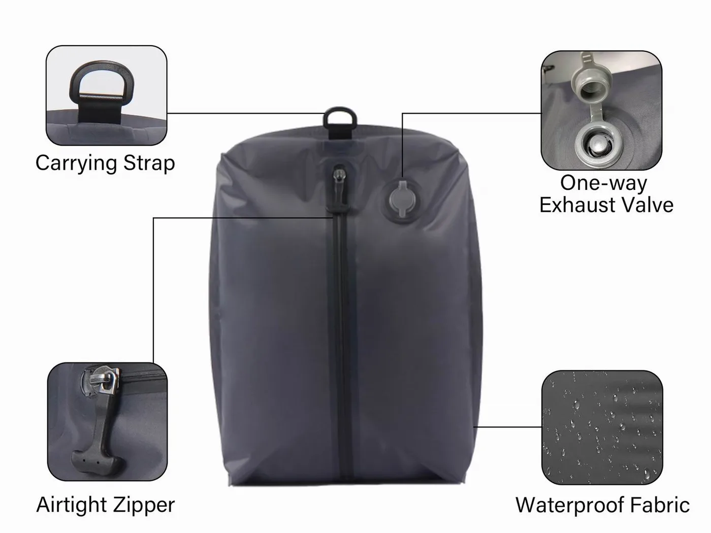
Colour is the first thing a shopper filters on and the first thing that disappoints them if the photography is wrong. Shoot every colourway under the same lighting setup and against the same neutral background, and include at least one frame where two shades sit side by side so the difference is unambiguous. Swatch chips rendered from hex values are a poor substitute and are the single biggest driver of shade-related returns online.
Naming does real work too. Descriptive names beat abstract ones in search: 'olive' and 'signal orange' are findable, while 'forest whisper' is not. Keep the name stable across seasons even if the Pantone reference moves slightly, because a returning buyer searches by the name they remember. Where a range includes reflective detailing, note it per colourway, since a reflective accent reads very differently on black than on mint.
Colour decisions that survive a product refresh
Ranges get refreshed every two to three seasons, and the colours are usually the part that changes. Protect the programme by keeping at least one neutral constant across refreshes so a retailer never has to change a planogram entirely, and by archiving signed physical references for every approved shade. A digital hex value is not a reference; fabric batches drift and the physical swatch is what a lab dip gets judged against.
Refresh accents more often than neutrals. A seasonal accent that is clearly labelled as limited keeps the range feeling current without destabilising the core, and it lets you test a shade at low volume before promoting it. When an accent earns its way into the top five SKUs by unit volume, graduate it into the core tier and buy the fabric as a full roll.
A colour brief you can hand to a production partner
- State the range size: number of colourways, and which sizes each one appears in.
- Give a physical reference for every shade, not a hex value, and name the light source used for approval.
- Set the Delta E target per component pairing: 1.0 for shell to webbing, 1.5 to 2.5 for film over print.
- List the fastness targets by standard: ISO 105-B02 light 4-5, X12 rubbing 4 dry, E02 seawater 4.
- Name the route to colour per shade: solution-dyed, piece dye, digital print or screen print.
- Specify hardware as a deliberate contrast or as neutral black; do not ask for a textile match.
- Confirm the fabric minimum per shade and who carries the residual if a shade is dropped.
- Fix the naming convention and the pattern scale rules before artwork starts.
A brief in that shape removes most of the sampling round trips that slow a colour programme down. Our team has produced waterproof bags since 2014 in an SGS-verified 4,950 m2 facility with 137 staff across seven production lines, and the colour conversations are always the longest part of a project because a shade has to survive fabric, film, hardware and retail lighting. Minimum order is 500 pieces per colourway, sampling runs 6 to 10 working days and bulk runs 35 to 50 days from FOB Xiamen.
Two more references are worth putting in the brief. The ASTM colour and appearance standards give you a defensible method for measuring Delta E when a dispute comes up, and the ISO 105 series is the language every testing laboratory already speaks. Then sanity-check the grid against how the product is actually used: the colour matching guide covers substrate drift in more depth, the pattern guide covers artwork scale, and the trend notes cover what is currently moving in outdoor channels. Our roll-top range and the wider product line show the same shades applied across formats, which is the quickest way to see whether a colourway survives the jump from 5L to 90L.
Frequently asked questions
Q1. How many colourways should a dry bag range have?
Four to six is the practical range for a first season: two permanent neutrals, one or two brand accents, and one seasonal shade. Three sizes across four colours gives 12 SKUs, which is manageable; five sizes across six colours gives 30 and usually is not.
Q2. What is a good Delta E tolerance for a bag range?
Aim for 1.0 or better between shell fabric and webbing, 1.5 to 2.5 for print under a translucent film, and treat hardware as a deliberate contrast rather than a match. Measure under CIEDE2000 and approve with a physical reference.
Q3. Which colour sells best for waterproof bags?
Black typically takes 30% to 40% of unit volume because it hides salt staining, scuffing and sunscreen residue. Olive and charcoal take most of the remainder in outdoor channels, with bright accents accounting for 10% to 20%.
Q4. Do bright colours fade faster on the water?
Yes. Saturated accents generally grade 4-5 on light fastness where solution-dyed neutrals grade 6 to 7, and chlorine dulls bright shades faster than dark ones. Specify ISO 105-B02 light fastness of 4-5 or better for any accent sold into pool or coastal channels.
Q5. What is the minimum order for a new colourway?
Plan on 500 pieces per colourway as the programme minimum, plus a fabric minimum of 300 to 500 m for a piece-dyed shade and 500 to 1,000 m for a solution-dyed one. Digital print can start at 50 to 100 m, which makes it the cheapest way to test a shade.
Q6. Can hardware be matched exactly to fabric?
No. Moulded POM, anodised aluminium and coated steel all reflect light differently from textile, so an exact match is not achievable and often looks wrong under retail LED. Specify hardware as neutral black or as a stated contrast.
Q7. Should every colourway come in every size?
No. Bright accents earn their place at 2L to 10L, where visibility matters, while 60L and larger should run in two neutrals only. Filtering the grid this way typically removes about a third of the SKUs without removing any shade from the range.
Q8. What fastness tests should I put in a bag specification?
Light fastness ISO 105-B02 at grade 4-5 or better, rubbing ISO 105-X12 at 4 dry and 3-4 wet, seawater ISO 105-E02 at 4, and chlorinated water ISO 105-E03 at 4. Add perspiration ISO 105-E04 at 4 where the bag contacts skin or straps.
Q9. Is digital print or screen print better for a dry bag?
Digital print has a much lower minimum, 50 to 100 m, and is ideal for seasonal or test shades and full artwork. Screen print suits flat spot colours and logos above roughly 300 m, and costs less per metre once the screens are made.
Q10. How do I stop a shade drifting between production batches?
Approve a lab dip against a signed physical reference rather than a hex value, keep that reference archived, and re-test when the dye house changes. Batch drift is the most common cause of a reorder not matching the original shipment.
Q11. Does a dark bag get too hot in the sun?
A black surface in 32 °C direct sun can reach 60 °C to 70 °C, roughly 12 °C to 18 °C hotter than a saturated orange one. That matters if the bag doubles as a cooler or holds electronics, and it is an argument for offering at least one light shade.
Q12. How do I name colourways for search?
Use descriptive, stable names: olive, charcoal, signal orange. Avoid abstract names that nobody searches for, and keep the name stable across seasons even if the Pantone reference moves slightly, because returning shoppers search by the name they remember.
Q13. What does an extra colourway add to unit cost?
Typically 4% to 9% at low volume, most of it from fabric minimums and write-off risk rather than from material. Changing a webbing colour, weld line or buckle finish refreshes a product at a fraction of that cost.
Q14. Should camouflage be a core or seasonal colourway?
Seasonal. Licensed patterns carry a per-unit royalty and a reporting obligation, and unlicensed repeats need artwork investment. Treat pattern as a distinct tier with its own naming convention and its own reorder trigger.
Q15. How often should I refresh a colour range?
Refresh accents every one to two seasons and neutrals every two to three. Keep at least one neutral constant across refreshes so a retailer never has to rebuild a planogram, and graduate any accent that reaches the top five SKUs into the core tier.
Q16. Can I photograph colourways with swatch chips instead of product?
No, not as the only image. Hex-rendered chips are the biggest driver of shade-related returns online because screens and coated film disagree. Shoot every colourway in the same lighting setup and include a frame with two shades side by side.
People also ask
How do you build a colour range for bags?
Decide the number of colourways from SKU count, split them 70/20/10 into core neutrals, brand accents and a seasonal shade, then set a Delta E target and fastness grades for each. Filter the size matrix so bright accents only appear where visibility sells.
What is Delta E and why does it matter for bags?
Delta E is a single number describing how far two colours differ, and it is the practical way to specify whether shell, webbing and film agree. A value of 1.0 or better is imperceptible on a bag; 2.5 is visible on a shelf.
Are light-coloured dry bags harder to keep clean?
Yes. Sunscreen, tanning oil and clay show on mint, sand and pale grey far more readily than on black or olive. Light shades suit short service windows and consumer channels; dark neutrals suit rental fleets.
How many SKUs is too many for a first bag range?
Above roughly 18 SKUs a first-season range starts spending more on inventory and photography than the marginal shade returns. Three sizes across four colours, at 12 SKUs, is a workable launch grid.
Do solution-dyed fabrics fade less than dyed ones?
Yes. Because pigment is added before extrusion, solution-dyed fabric typically grades 6 to 7 on light fastness against 4 to 5 for piece-dyed, and it holds colour better in seawater and chlorine. The trade-off is a narrower colour library and a higher minimum.
What colour should a dry bag be for safety on the water?
A saturated orange or signal yellow. Visibility from 200 m offshore is a functional difference, not styling, so keep at least one high-visibility shade in the range and consider it alongside reflective detailing for low light.
Need this in production volume?
QUANZHOU JUNYUAN BAGS has produced waterproof bags since 2014 in an SGS-verified 4,950 m2 facility in Fujian, China. Minimum order 500 pieces, sampling in 6–10 working days, bulk in 35–50 days, FOB Xiamen — write to service@junyuanbags.com with your spec and target market.