Home / Blog / Design & Branding
Logo Placement on Dry Bags
On a 20L roll-top dry bag the front face gives a genuinely usable print window of about 180 x 220 mm once you subtract a 25 mm keep-clear margin around every weld, and that window is where a logo belongs if it needs to be read from three metres. The collar adds a second band roughly 220 x 45 mm that only shows when the bag is rolled closed, the end panels on a duffel are the surfaces a hand-carried bag actually presents to a room, and the base panel is a wasted placement on any bag that spends its life on sand. Put the mark 40 mm above the bottom weld, keep it off the fold line, and it survives a season; put it across a seam and the edge lifts within months.
This guide maps the print-safe geometry of a roll-top bag, a dry duffel and a waterproof backpack, sets out how large a wordmark has to be to stay legible at a given distance, compares the print methods that hold up on TPU film against those that only work on a woven face, and gives a size ladder from 5L to 40L. Every number here comes from real panel measurements rather than a flat artwork mock-up, because a bag is a curved object that changes shape the moment you fill it.
- Why logo placement on a waterproof bag is a geometry problem
- Mapping the print-safe zones on a roll-top bag
- How large a mark has to be to read at three metres
- The collar band: the placement most brands skip
- Base panels, gussets and the surfaces nobody photographs
- Backpack panels and the harness shadow
- Duffel ends and the carry-handle sightline
- Matching the print method to the zone
- Contrast and colour: what wet film does to a mark
- Placement across a size ladder from 5L to 40L
- Compliance marks that have to appear somewhere
- Windows, reflective accents and the detail that sells at night
- A placement brief you can hand to a production partner
Why logo placement on a waterproof bag is a geometry problem
A dry bag is not a flat panel, and that is the first thing to accept before you place any artwork. The body is assembled from welded panels that curve in two directions as soon as the bag is loaded, the closure consumes the top third of the height, and every seam is a 20 to 30 mm band of fused film that accepts ink differently from the face fabric around it. Artwork laid across a weld line produces a ridge that flexes harder than the surrounding surface, and that ridge is where a print edge starts to lift.
The working rule is a 25 mm keep-clear margin around every weld, around the roll line and around any D-ring or strap attachment. On a 10L bag that margin removes close to 35% of the nominal front panel, which is why the usable window on a small bag is often only 120 x 150 mm even though the panel itself measures 160 x 210 mm. Design for the window, not for the panel, and the mark will still look deliberate after a year of folding.
There is also a sequence constraint. Many bags are printed flat, then welded, then the closure is fitted, so a mark placed near the mouth is handled and folded several times during assembly. Anything within 60 mm of the mouth sees the most handling and the most abrasion in use. The middle third of the front face is the calmest real estate on the whole bag.
Mapping the print-safe zones on a roll-top bag
Six zones exist on a typical roll-top and each one has a different visibility profile. The front face is read when the bag sits upright on a table or in a retail shelf. The collar band is read when the bag is closed and carried by its top handle. The reverse panel is read when the bag is worn or slung. The base is read only when someone picks the bag up and turns it over, which in practice means almost never outside a photography session.
Side gussets sound useful and rarely are; on a cylindrical roll-top the gusset is a narrow curved strip, and a logo placed there reads as a distorted smear unless the artwork is under 30 mm tall. Webbing and handles are the exception: a woven label sewn or welded onto a 25 mm strap is one of the most durable placements available and costs very little per unit.
| Zone | Usable area on a 10L | Usable area on a 20L | Read when | Durability |
|---|---|---|---|---|
| Front face panel | 120 x 150 mm | 180 x 220 mm | Upright on a table or shelf | High |
| Roll-top collar band | 150 x 40 mm | 220 x 45 mm | Carried closed by the handle | High |
| Reverse panel | 120 x 150 mm | 180 x 220 mm | Worn on the back | Medium |
| Base panel | 110 x 110 mm | 160 x 160 mm | Only when turned over | Low, abrades fast |
| Side gusset | 60 x 120 mm | 80 x 160 mm | Rarely | Medium |
| Webbing or handle | 20 x 60 mm | 25 x 90 mm | Whenever it is carried | Very high |
How large a mark has to be to read at three metres
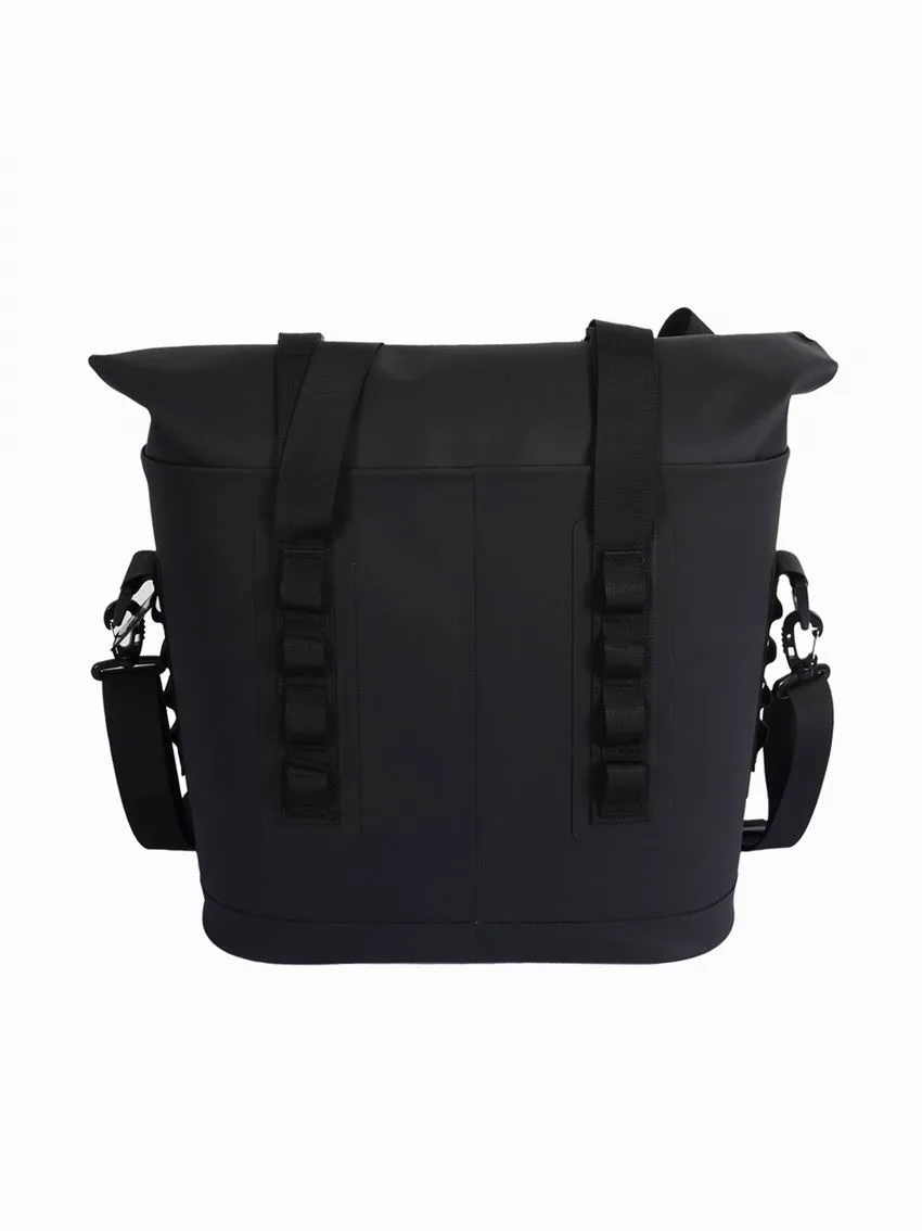
Legibility on a bag follows the same rule as signage, with a penalty for curvature and for wet gloss. A rough division works well: minimum cap height in millimetres equals the viewing distance in metres divided by 120, so a mark read at 3 m needs about 25 mm of cap height. Flat artwork lets you use distance divided by 200, but a wet, curved TPU face is not flat artwork, and the glossy surface eats contrast at grazing angles.
That penalty matters most on dark colourways. A mid-grey wordmark on a black bag that reads perfectly on a screen disappears on the water at 4 m, while the same mark in white or a saturated accent stays legible at 6 m. If your palette is restrained, gain the contrast back with a 1.5 mm outline or a solid backing block rather than by enlarging the mark beyond the print window.
| Viewing distance | Minimum cap height | Recommended cap height | Typical use |
|---|---|---|---|
| 1 m | 8 mm | 12 mm | Hang tag or care label |
| 2 m | 17 mm | 22 mm | Retail shelf, eye level |
| 3 m | 25 mm | 32 mm | Beach or deck, bag on the ground |
| 5 m | 42 mm | 55 mm | Across a campsite or hire desk |
| 10 m | 83 mm | 110 mm | Event branding, photography |
The collar band: the placement most brands skip
When a roll-top is closed with three folds, the surface that faces outward is a band roughly 40 to 50 mm tall running the full width of the mouth. On a 20L bag that is about 220 x 45 mm of prime, eye-level space that almost nobody uses. It is the surface a passer-by sees when the bag is hanging from a shoulder strap or sitting in a boat with the closure up.
The catch is that the visible portion shifts with how tightly the bag is rolled, so a single centred mark can end up half hidden on the underside of a fold. The fix is a repeating wordmark with a 60 mm pitch: however the bag is rolled, at least one complete mark lands on the visible face. Keep stroke weight at 1.2 mm or heavier, because the collar is the most handled part of the bag and fine detail abrades there first.
Base panels, gussets and the surfaces nobody photographs
The base of a dry bag spends its working life in contact with sand, gravel, boat decks and concrete. A print there is a consumable: expect visible scuffing inside 30 to 60 days of regular use, and full loss of fine detail inside one season. That is not a reason to leave the base blank, but it is a reason to put the disposable content there rather than the brand mark.
The base is the right home for fibre composition, country of origin, the recycling symbol, a batch code and any compliance text that has to appear somewhere. Those marks need to survive a washing instruction, not a marketing photo. Keep the type at a minimum 2.8 mm cap height, which is roughly 8 pt, and set it in a single colour so it stays readable as it wears.
Backpack panels and the harness shadow
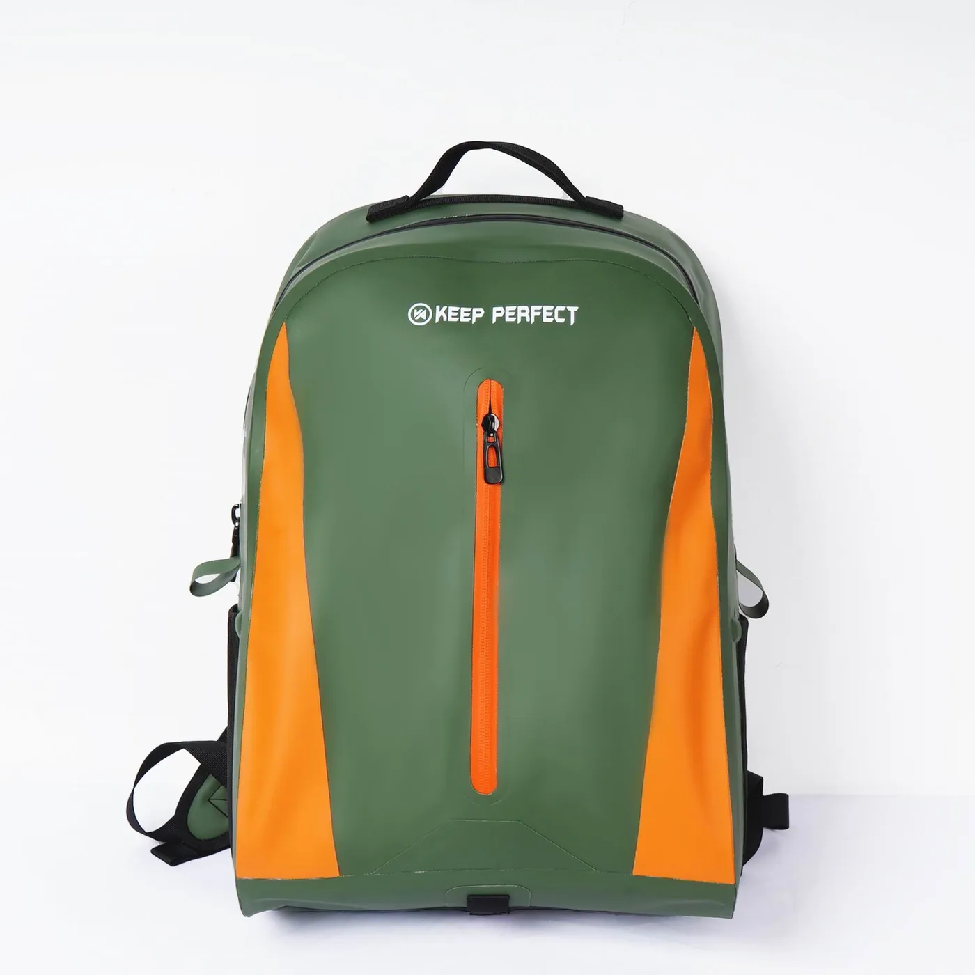
On a waterproof backpack the panel that looks biggest in a flat artwork file is usually the one the harness covers. Straps, a back pad and a sternum strap can hide 50 to 60% of the rear panel, and any artwork in that shadow is invisible the moment somebody wears the bag. The surfaces that actually read are the lid or top panel, seen when the bag is set down, and the lower front panel, seen from behind while it is being carried.
A small repeat mark on the shoulder strap pad is the cheapest visibility you can buy on a backpack, because the strap is at eye level for anyone walking behind the wearer. Keep it to a 15 mm cap height and place it on the curved outer face of the pad, not on the underside where it rubs clothing. Our TPU waterproof backpack line uses a welded top panel precisely because a flat print surface reads better than a curved one.
Duffel ends and the carry-handle sightline
A duffel behaves differently again, because the way it is carried decides what people see. Carry it by the top handles and the two end panels face outward to the room; carry it crossbody and the long side panel faces out; sling it over a shoulder and the upper third of the near end is what registers. End panels are also flat and taut, which makes them the most forgiving surface for detailed artwork on any waterproof bag.
End panels come in a limited diameter, though. On a 30L duffel the end circle is about 230 mm across, so a logo wider than 170 mm starts to crowd the edge weld. Centre the mark with at least 30 mm to the seam on every side and use the remaining ring for a small repeat pattern or a size call-out, which is genuinely useful on a range where three sizes look identical from a distance.
Matching the print method to the zone
Not every decoration method bonds to a welded film. Screen printing with a flexible, plasticiser-resistant ink works on TPU and on PVC, and remains the default for a two-colour wordmark. Digital transfer gives photographic detail and gradients but adds a layer that can be scratched, so it belongs on panels that do not touch the ground. A woven label on webbing is effectively permanent and is the only method that survives strap abrasion year after year.
Embroidery is the method people ask for first and the one that fails most often on film: the needle perforates the waterproof layer, so it is only viable on a woven face panel with a separate internal barrier, never directly through a TPU body. Rub resistance is the number to compare across methods, and the standard test for it is defined by ASTM; ask for a cycle count rather than a verbal assurance.
| Method | Works on | Typical rub cycles to visible wear | Minimum stroke | Best zone |
|---|---|---|---|---|
| Screen print, flexible ink | TPU and PVC film | 4,000-6,000 | 1.0 mm | Front face, collar |
| Digital transfer | Flat film panels | 1,500-2,500 | 0.6 mm | Front face only |
| Heat-transfer vinyl | Woven face fabric | 2,000-3,000 | 1.5 mm | Side gusset |
| Woven label | Webbing and handles | 10,000+ | n/a | Straps, grab handles |
| Silicone badge | Film or fabric | 8,000-12,000 | 2.0 mm | Front face, lid |
| Embroidery | Woven face only | 6,000-9,000 | 2.5 mm | Never through TPU |
Contrast and colour: what wet film does to a mark
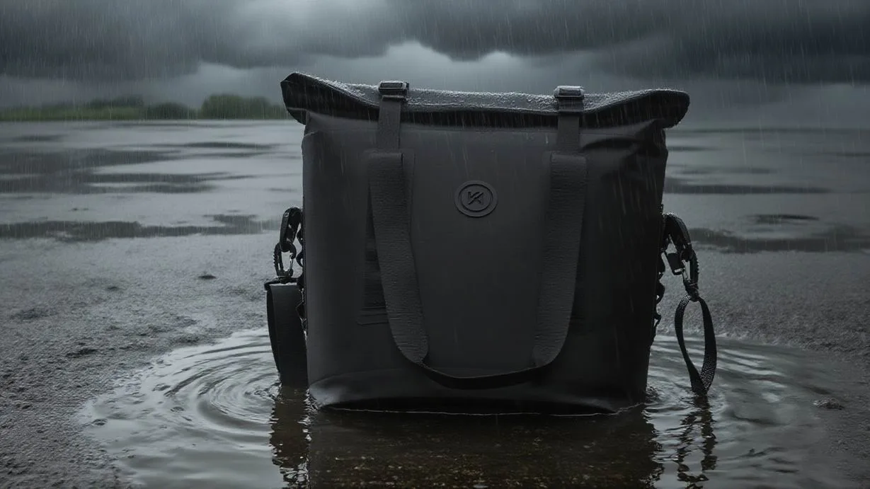
Wet TPU darkens. A colourway that looks mid-tone on a dry sample drops roughly one step in perceived lightness once a film of water sits on it, and gloss adds a specular highlight that can wash out thin strokes entirely. Light grey on olive and pale blue on black are the two combinations that fail most often in field photography; white, a saturated accent, or a dark mark on a light colourway hold up in every lighting condition we have tested.
Colour fastness is measurable, so specify it rather than describing it. Ask for wet and dry rub fastness figures rated under the ISO 105 series published by ISO, and set an internal floor of 4 for dry rub and 3 to 4 for wet rub on any bag heading for salt water. Salt crystals are abrasive, and a mark that passes a dry rub test can lose a grade once it is rubbed with sand between the fingers.
Placement across a size ladder from 5L to 40L
A range looks coherent when the logo holds a constant proportion of the panel rather than a constant size. Keeping the mark at 25 to 30% of the usable panel height makes a 5L and a 40L read as one family on a shelf, while a fixed 40 mm mark looks oversized on the small bag and lost on the large one. The trade-off is cost: a different print screen per size adds setup, so most ranges compromise with two artwork sizes across five bag sizes.
Two artwork sizes is the pragmatic answer. Group 5L and 10L into a small artwork, group 20L and 30L into a medium, and give 40L its own large artwork if it is a flagship. Below about 4 mm of stroke width on the small artwork, switch to a simplified lock-up with fewer letters; fine detail that survives on a 40L becomes mush on a 5L printed with the same file.
| Bag size | Usable front window | Logo height at 28% of panel | Artwork group | Recommended method |
|---|---|---|---|---|
| 5L | 90 x 110 mm | 31 mm | Small, simplified | Screen print, 1 colour |
| 10L | 120 x 150 mm | 42 mm | Small | Screen print, 2 colour |
| 20L | 180 x 220 mm | 62 mm | Medium | Screen print or silicone |
| 30L | 200 x 240 mm | 67 mm | Medium | Screen print or silicone |
| 40L | 230 x 280 mm | 78 mm | Large | Screen print or transfer |
Compliance marks that have to appear somewhere
Fibre composition, country of origin, a traceable batch code and the relevant recycling or disposal symbol all need a home on the bag. None of them belongs on the front face, where they clutter the brand mark, and none of them belongs on a hang tag alone, because the tag is the first thing a user throws away. The base panel and the inside of the collar are the two placements that survive the life of the bag.
If the bag is sold into more than one market, assume the required text will change and keep a printed panel rather than a welded moulding so the artwork plates stay cheap to update. Care text printed directly on film must survive the same washing cycle the bag is rated for, which is another reason to keep it to one colour and a legible size; the details of tag versus printed label are covered in our hang tag and label guide.
Windows, reflective accents and the detail that sells at night
A clear window changes the placement maths completely, because the window weld adds a second seam that artwork must avoid and the transparent film behind it distorts anything printed within 15 mm of the edge. Keep all artwork outside the window, or print a small mark directly onto the window film itself using an ink rated for a transparent substrate.
Reflective accents are the highest-value add-on per gram on any bag used near water at dusk. A 20 mm reflective band placed low on the front panel catches a torch beam at 40 to 60 m, and it can be cut into a logo shape without losing much retro-reflective area. Placement low and wide beats placement high and narrow, because vehicle and boat lights sit low relative to a carried bag.
A placement brief you can hand to a production partner
- State the bag style, size and fabric: TPU film at 0.3 mm or 0.5 mm changes the ink system.
- Give artwork in vector form with a stated cap height in millimetres, not a percentage.
- Mark the 25 mm keep-clear margin around every weld, fold line and hardware point on the drawing.
- Name the method per zone, with a minimum stroke weight for the smallest size in the range.
- Specify dry and wet rub fastness targets and the standard they are tested against.
- Say which panel carries compliance text and which carries the brand mark.
- Ask for a printed sample on the actual production film, not on a flat swatch.
- Confirm the mark survives three rolls of the closure without disappearing under a fold.
Writing those eight lines before artwork starts removes most of the revisions that delay a bag programme. The most common failure we see is a beautiful flat mock-up that cannot be printed inside the real window, and the second is a mark placed over a weld that lifts after a month of salt use. Both are geometry problems, and both are solvable on paper.
On the production side, decisions about panel sizes, weld margins and print method are all locked in at the sampling stage. Our team has built waterproof bags since 2014 in an SGS-verified 4,950 m2 facility with seven production lines, sampling runs 6 to 10 working days and a 500-piece minimum applies per colourway.Bring placement drawings to the sample stage, because panel geometry is far cheaper to change before tooling than after.
Two further decisions interact with placement: how the print behaves across a multi-colour range, and whether the closure area carries a second mark. Our colour matching guide covers tolerance between colourways, the digital versus screen comparison sets out detail limits, and the colour range guide explains how many colourways a range should carry. Compare the placements against the current product line before final artwork, and check the window branding notes if your design includes a transparent panel.
Frequently asked questions
Q1. Where should a logo go on a dry bag?
On the front face panel, centred horizontally and 40 mm above the bottom weld, sized to about 28% of the usable panel height. On a 20L bag that means roughly a 62 mm mark inside a 180 x 220 mm window, with a 25 mm margin around every seam.
Q2. How big should a logo be on a 10L dry bag?
About 42 mm of cap height, which is 28% of the 150 mm usable panel height. Smaller than 30 mm and it stops reading past two metres; larger than 55 mm and it crowds the weld margins on the sides.
Q3. Can you print over a welded seam on a dry bag?
No. A weld is a fused band 20 to 30 mm wide that flexes differently from the face fabric, and ink laid across it cracks and lifts within a season. Keep a 25 mm clear margin around every weld and around the roll line.
Q4. Is the collar band worth printing on?
Yes, and it is the most underused surface on a roll-top bag. The closed collar presents a band about 45 mm tall at eye level. Use a repeating wordmark on a 60 mm pitch so one complete mark always lands on the visible face regardless of how tightly the bag is rolled.
Q5. What is the best print method for TPU film?
Screen printing with a flexible, plasticiser-resistant ink, which typically reaches 4,000 to 6,000 rub cycles before visible wear. Silicone badges last longer but need a 2 mm minimum stroke. Avoid embroidery directly through TPU because the needle perforates the waterproof layer.
Q6. Should the base panel carry branding?
Only secondary content. A base print is scuffed visibly within 30 to 60 days of regular use on sand or concrete. Use the base for fibre composition, origin, batch code and disposal symbols, and keep type at a minimum 2.8 mm cap height.
Q7. How do I keep a logo legible on a wet black bag?
Use white or a saturated accent rather than mid-grey, and add a 1.5 mm outline or solid backing block if the palette is restrained. Wet TPU darkens about one step in perceived lightness and gloss washes out thin strokes at grazing angles.
Q8. What rub fastness rating should I ask for?
A minimum of 4 for dry rub and 3 to 4 for wet rub under the ISO 105 series. Salt crystals are abrasive, so a mark that passes a dry test can drop a full grade once it is rubbed with sand between the fingers.
Q9. Can you embroider a logo on a dry bag?
Only onto a woven face panel with a separate internal barrier, never through a TPU or PVC body. The needle perforates the waterproof film. On film bags a silicone badge gives a similar raised look with no perforation and a longer service life.
Q10. How close to the roll-top mouth can artwork go?
Stay at least 60 mm below the mouth. That area sees the most handling during assembly and the most folding in use, and fine detail abrades there before anywhere else on the bag. The middle third of the front face is the calmest zone.
Q11. Do end panels work better than side panels on a duffel?
End panels, yes. They are flat and taut, which suits detailed artwork, and they face the room when the bag is carried by its handles. On a 30L duffel the end circle is about 230 mm, so keep the logo under 170 mm wide with 30 mm to the seam.
Q12. How do I keep artwork consistent across five bag sizes?
Size the mark as a proportion of the panel, around 25 to 30% of usable height, rather than a fixed millimetre value. In practice most ranges use two artwork sizes across five bag sizes to avoid a separate print screen for every size.
Q13. Where do compliance and care marks belong?
On the base panel or the inside of the collar. Both survive the life of the bag, neither competes with the brand mark, and both remain legible after washing. Never rely on a hang tag alone, because it is the first thing a user discards.
Q14. Can artwork be printed on a clear window?
Yes, but only with an ink rated for a transparent substrate, and never within 15 mm of the window weld where the film distorts. Otherwise place all artwork outside the window and treat the weld as an additional keep-clear seam.
Q15. Does a reflective logo lose reflectivity?
Yes, proportionally to the area removed. A 20 mm reflective band cut into a logo shape still catches a torch beam at 40 to 60 m. Place it low and wide on the front panel, because boat and vehicle lights sit low relative to a carried bag.
Q16. When should placement be finalised in a bag programme?
At the sampling stage. Panel geometry, weld margins and print method are all locked in together, and changing panel dimensions after tooling is far more expensive than adjusting artwork before it. Print the test mark on the real production film, not on a flat swatch.
People also ask
What is the best place to put a logo on a dry bag?
The front face panel, centred and positioned about 40 mm above the bottom weld with a 25 mm clear margin around every seam. On a 20L bag that is a mark of roughly 62 mm inside a 180 x 220 mm window.
How do you print a logo on TPU material?
Screen print with a flexible, plasticiser-resistant ink after the film has been surface treated, then cure at the temperature the ink system specifies. Digital transfer works for gradients but adds a scratch-prone layer, so keep it off panels that touch the ground.
Why does my printed logo peel off a dry bag?
Usually because it crosses a weld or sits within 25 mm of one, where the film flexes harder than the flat face. The second cause is an ink system that was not matched to the film, so the print stays brittle and cracks at the fold.
Are woven labels better than printed logos on dry bags?
For webbing and handles, yes: a woven label survives more than 10,000 rub cycles where a printed mark on film reaches 4,000 to 6,000. For large front panels a screen print is cheaper per unit and carries more colour.
How big should a logo be to be visible from 5 metres?
About 42 mm of cap height as a minimum and 55 mm recommended, using the rule of distance in metres divided by 120 for a wet curved surface. Flat signage can use distance divided by 200, but a glossy bag is closer to the stricter figure.
Can you put a logo on the bottom of a dry bag?
You can, but it wears quickly: expect visible scuffing within 30 to 60 days on sand or concrete. The base is better used for composition, origin, batch code and disposal marks, which need to survive washing rather than photography.
Need this in production volume?
QUANZHOU JUNYUAN BAGS has produced waterproof bags since 2014 in an SGS-verified 4,950 m2 facility in Fujian, China. Minimum order 500 pieces, sampling in 6–10 working days, bulk in 35–50 days, FOB Xiamen — write to service@junyuanbags.com with your spec and target market.